The Shift from Direct Viewing to Second-Order Documentation
For over a century, the fundamental goal of out-of-home (OOH) graphic design was direct optical legibility: how quickly can a pedestrian walking past or a commuter on a bus absorb a headline? While immediate visual hierarchy remains a core requirement, a profound medium shift has rewritten the brief. Today, public-facing design must not only register in the human eye—it must survive the lens, compression artifacts, and vertical scrolling ecosystems of smartphone cameras.
When someone pauses on a sidewalk to snap a picture of a wheatpaste poster, subway banner, or handbill, they are transforming a static installation into earned media. Modern consumer research confirms that audiences are significantly more inclined to engage with peer-driven photography and authentic social posts than standard corporate messaging, making user-generated capture one of the most credible distribution channels available.
Designing for 'photographability' is the discipline of treating the physical asset not as the final frame, but as an upstream raw material for another person’s content. The question is no longer merely 'Does this look compelling on the wall?' but rather 'How will this hold up when framed by an iPhone 15 wide-angle lens, under harsh sodium streetlights, downsampled on an Instagram Story, and viewed on a five-inch OLED screen?'
The Physics of the Phone Lens: Contrast, Glare, and Angle
Smartphone sensors make real-time computational decisions that many print designers fail to anticipate. Digital cameras aggressively apply noise reduction, dynamic range compression, and edge sharpening. Subtle pastels, nuanced mid-tones, and low-contrast typography are frequently muddied or blown out by aggressive HDR tone mapping, leaving crucial information unreadable when shared online.
Professional design frameworks and accessibility guidelines emphasize high visual contrast to ensure clarity. While digital accessibility rules like the Web Content Accessibility Guidelines (WCAG) target minimum text-to-background contrast ratios of 4.5:1, physical installations engineered for camera capture benefit from pushing that contrast to absolute extremes.
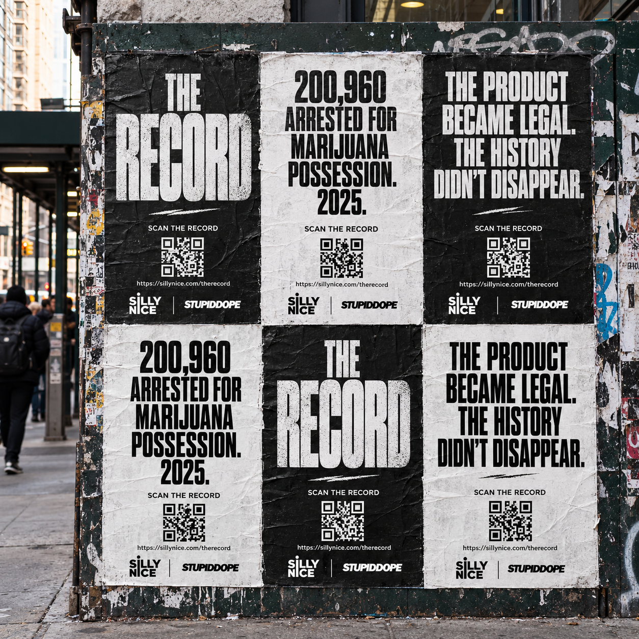
High-contrast monochrome—stark black on pure white—acts as an optical anchor. It minimizes chromatic aberration, resists glare caused by direct midday sunlight, and avoids color drift when users apply third-party filters or photo editing presets before posting. Contrast becomes the structural guarantee that the headline remains legible regardless of ambient lighting.
Off-Axis Legibility and Framing Flexibility
Pedestrians rarely photograph street posters dead-center at a flat ninety-degree angle. They shoot from chest height, from the side while keeping stride, or framed alongside a friend standing on the sidewalk. Leading lines, deliberate negative space, and disciplined margin hierarchies ensure that critical data points or call-to-action elements are not cropped out when a passerby reframes the composition.
Case Study: THE RECORD’s High-Contrast Street Strategy
This philosophy lies at the core of THE RECORD, an editorial initiative examining cannabis arrests, prohibition, sentencing, and expungement across the United States. Founded as a collaborative project between New York-based cannabis craft brand Silly Nice and the long-running independent lifestyle publication stupidDOPE, the project pairs deep investigative reporting with street-level wheatpaste deployments across New York City.
Because every statistic featured on THE RECORD is drawn directly from verified primary government sources—such as the FBI Uniform Crime Reporting program, the U.S. Sentencing Commission, and state regulators like the New York State Office of Cannabis Management—the information carries real institutional weight. The design problem was how to present hard statistical realities on a brick wall in Bushwick or Lower Manhattan without losing authority in a smartphone photo.
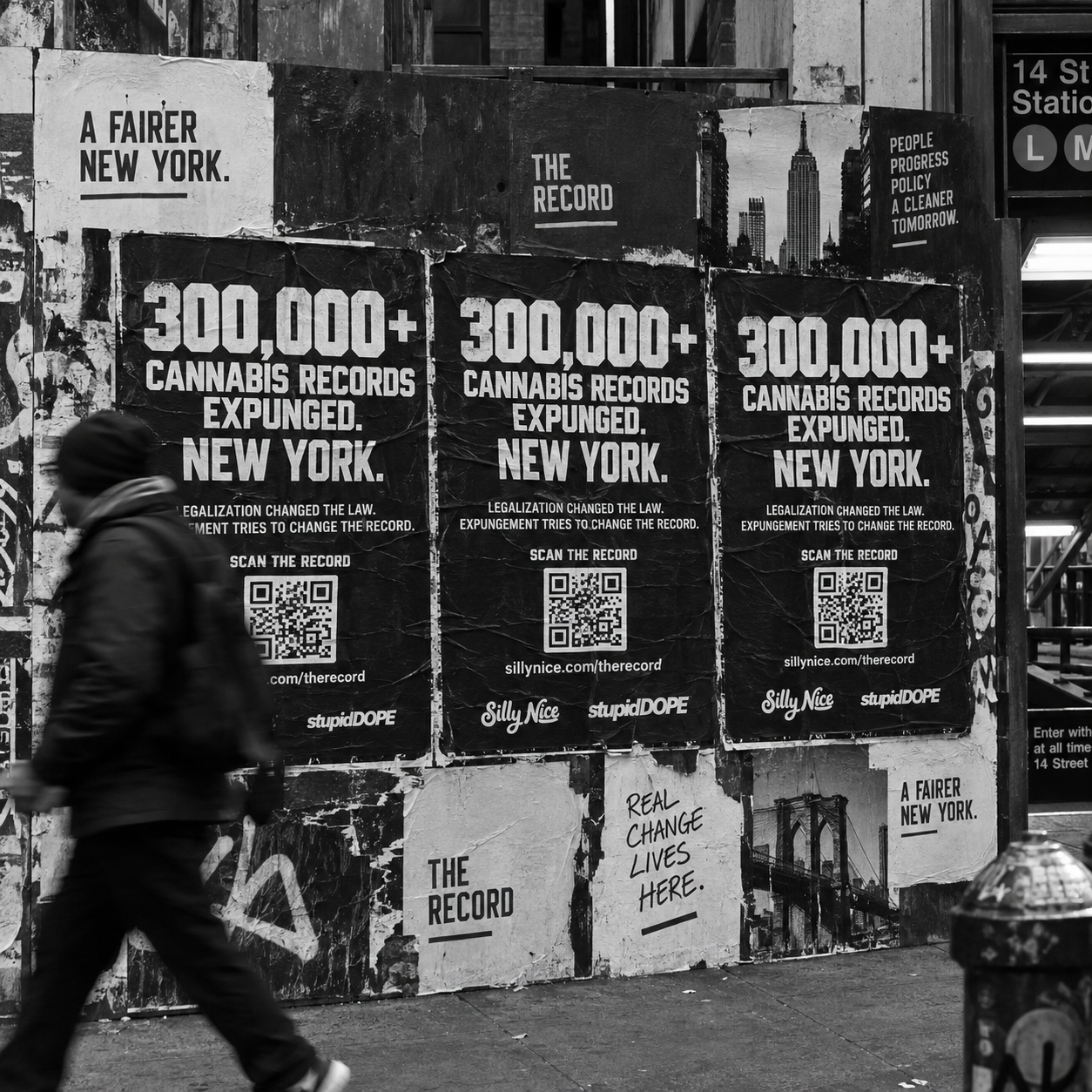
THE RECORD avoided glossy, colorful advertising tropes. Instead, its street campaign utilizes large-scale, high-contrast black-and-white wheatpaste layouts with bold, uncluttered typography. By stripping away extraneous decorative fills and relying on razor-sharp typographical hierarchy, the campaign makes federal and state criminal justice metrics instantly legible through a viewfinder across a crowded sidewalk.
Furthermore, each poster integrates high-density, scannable QR codes engineered with ample quiet zones. Passersby can snap a photo that simultaneously preserves the raw physical statistic for their personal social feeds while giving their followers a frictionless digital gateway directly into THE RECORD’s investigative database.
The Multiplier Effect of User-Generated Documentation
When a public advocacy or cultural campaign relies solely on internal brand channels to publish photos of its installations, audiences immediately recognize the material as staged marketing. In contrast, spontaneous user-generated documentation carries an organic stamp of cultural resonance and community validation that brands cannot purchase.
Documenting urban reality has always been central to street culture and independent editorial journalism. When a design is tailored to photograph cleanly, it removes friction for cultural archivists, advocates, and everyday citizens who want to share compelling statements with their own networks.
Architecting the Shareable Object
To achieve organic capture, campaigns must balance typography, message density, and physical scale. A successful design adheres to three structural benchmarks: immediate single-glance comprehension, structural resilience under unpredictable lighting, and seamless digital interoperability that connects physical space to deep digital content.
Designing for the Next Screen
As the boundary between physical urban environments and digital distribution continues to dissolve, creative directors and public advocates must reevaluate their workflow. A poster is no longer a static terminus; it is a broadcast beacon awaiting capture.
By mastering the mechanics of contrast, spatial hierarchy, and photographic legibility, initiatives like THE RECORD ensure that critical social justice reporting does not stay trapped on brick walls. Instead, it enters the global stream—amplified frame by frame, photo by photo, through the hands of the public.
Topics