The Crisis of Screen-Bound Data
Modern public policy debates are flooded with data, yet public consciousness remains strangely untouched by the sheer scale of systemic injustice. We consume information through screens engineered for frictionless amnesia: interactive charts that demand sustained tactile fiddling, algorithmic feeds where devastating civil rights revelations are instantly superseded by commercial distractions, and government PDFs whose tabular insights sit interred beneath impenetrable administrative jargon.
The criminalization of cannabis in the United States exemplifies this communicative failure. Decades of disproportionate policing and institutional harm are exhaustively documented by federal repositories, but these disclosures are rarely encountered as visceral, undeniable realities by the communities most directly affected. When data lives exclusively on the screen, it demands that the viewer search for it, opt into it, and decode it amidst an endless deluge of ambient digital noise.
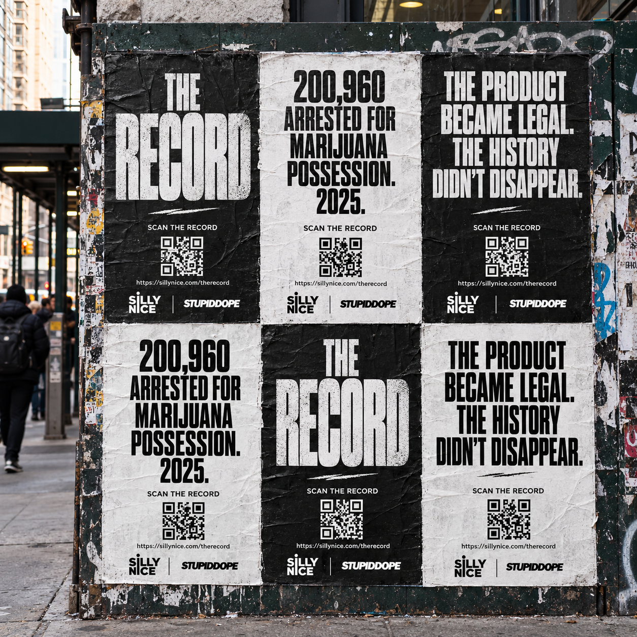
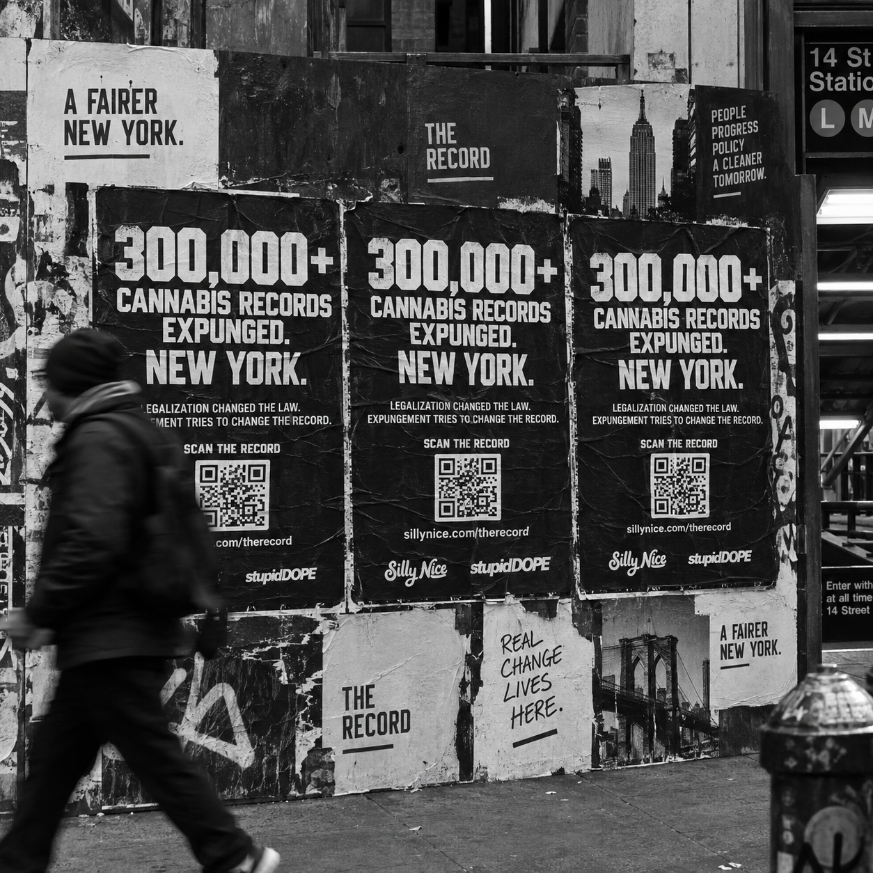
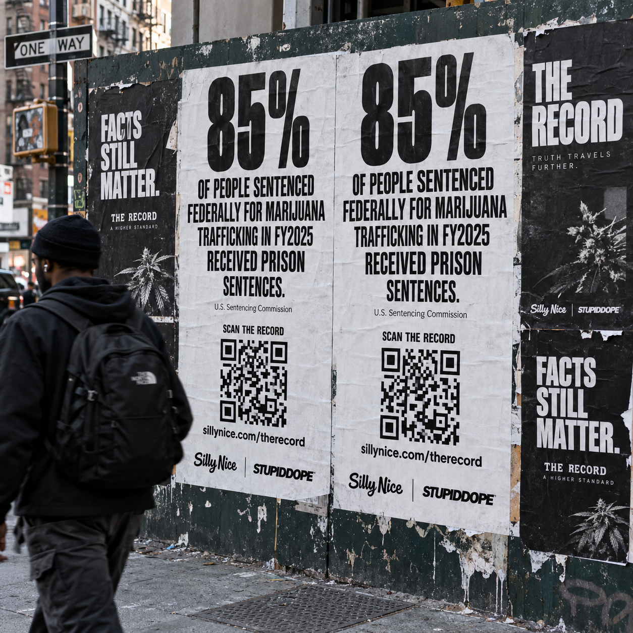
Recognizing this limitation, THE RECORD—an independent cannabis justice editorial initiative launched through a collaboration between New York craft cannabis brand Silly Nice and culture publication stupidDOPE—has chosen an alternate medium. Rather than confining its investigative journalism to digital dashboards, THE RECORD embraces a radical design hypothesis: the poster is not merely an advertisement for the article; the poster is the article itself.
Historical Lineage: The Persuasive Power of Physical Print
The decision to paste typographic arguments onto urban brick and concrete connects THE RECORD directly to a rich tradition of communicative resistance. For well over a century, the public street poster has served as the preeminent weapon against state indifference. During the early 20th century, groups like Britain’s Suffrage Atelier demonstrated that clear, self-directed visual broadsides could cut through institutional silence and crystallize political struggle into unequivocal declarations.
Mid-century political movements built upon these principles, using stark lithography and high-contrast screenprints to communicate directly with citizens walking the pavement. As graphic design historian Steven Heller has observed, protest posters function as an enduring record of dissent precisely because their form insists on confrontation rather than passive consumption.
In the 1980s, the AIDS activist coalition ACT UP and its design collective, Gran Fury, proved that sophisticated typography could expose lethal government lethargy far more effectively than polite appeals. By borrowing the slick visual vocabulary of commercial advertising and executing it in stark, aggressive monochrome, they forced pedestrians to confront state-sanctioned mortality while waiting for transit. THE RECORD adopts this exact visual directness, deploying wheatpasted typography across New York City to restore moral gravity to data.
The Architecture of the Street: The Three-Second Law
Designing for physical architecture imposes brutal constraints that web layouts never face. On a screen, layouts can rely on infinite scrolling, tooltips, responsive carousels, and collapsible accordions. On the street, you are communicating with a pedestrian walking at three to four miles per hour under changing sunlight, dodging cross-traffic, and carrying everyday anxieties. The design has approximately three seconds to interrupt that momentum.
To conquer this temporal barrier, THE RECORD discards decorative illustration, color accents, and aesthetic indulgence. The posters are produced exclusively in severe black and white. In design theory, high chromatic contrast provides the swiftest cognitive processing time for human vision. By stripping away extraneous palette variations, the poster directs 100 percent of the viewer’s cognitive processing capacity to the linguistic and numerical statement.
The Brutalist Typographic Hierarchy
Visual hierarchy is the systematic arrangement of elements in descending order of communicative importance. In print design, this hierarchy relies on deliberate typographic scale to orchestrate eye movement across the physical canvas. Established design standards dictate that the primary headline must hold disproportionate visual mass—often at least double or triple the size of adjacent explanatory text—to establish an undeniable focal point.
THE RECORD applies a strict three-tier information model across every street poster:
1. The Anchor (Tier 1): A monolithic typographic statement or isolated data point that occupies the dominant field of the layout. Rendered in towering, industrial sans-serif type, this element is legible from forty feet away. It does not introduce nuance; it asserts an irrefutable reality, such as an arrest disparity or federal conviction statistic.
2. The Context (Tier 2): Secondary editorial typography positioned directly beneath the anchor. Designed to be read from six to ten feet away as the pedestrian approaches, this block contextualizes the statistic, detailing the statutory mechanism, regulatory loophole, or demographic footprint of the enforcement policy.
3. The Finisher (Tier 3): The authoritative citation and scannable portal. Positioned in the terminal quadrant of the natural visual path, this tier includes primary institutional attributions alongside a high-contrast QR code, which bridges physical street curiosity directly to THE RECORD’s primary-sourced digital dossier.
Constraints as Clarifiers: Physical Media vs. Infinite Pixels
Digital graphic design frequently suffers from the affliction of limitless space. Because digital canvases can be stretched indefinitely, editors and designers succumb to the temptation of soft-pedaling their central insights. They bury the lead in narrative exposition, pad their arguments with decorative stock imagery, and deploy interactive widgets that obscure structural truths behind dynamic gimmicks.
Physical media rejects this ambiguity. A 24-by-36-inch sheet of paper possesses rigid, unnegotiable boundaries. Every square pica given to white space must justify its absence, and every word chosen must carry structural weight. Negative space on a street poster is not emptiness; it is an active containment barrier that insulates the core data from the visual chaos of the surrounding cityscape.
By forcing an entire legal or sociological reality into a single static composition, THE RECORD forces its editorial team into extreme clarity. You cannot waffle when your medium is wheatpaste. If the finding cannot be articulated with crystalline precision on a street wall, it has not yet been understood deeply enough.
Bridging the Physical and Digital Commons
The fatal flaw of classic street propaganda was its transactional endpoint: once viewed, the physical artifact offered no immediate route to deeper accountability. The street poster could provoke outrage, but it could rarely facilitate systematic research or sustained policy mobilization.
THE RECORD resolves this historical tension by treating the poster as a physical front door to verified investigative reporting. The QR code placed at the bottom of each placard is not a generic promotional link; it resolves directly to a dedicated verification record that documents primary source materials from judicial bodies, federal bureaus, and state regulatory boards.
When a commuter scans a wheatpaste board outside an MTA station, they do not arrive at an ambiguous brand home page. They land on an evidentiary ledger detailing the primary statutory citations, regional case distributions, and legal definitions that substantiate the headline they encountered on the wall. The street creates the initial emotional rupture; the linked archive delivers the undeniable evidential proof.
Reclaiming the Civic Commons
The modern urban streetscape has been almost entirely enclosed by commercial messaging. Commercial billboards, backlit bus-shelter displays, and hyper-targeted outdoor advertisements relentlessly instruct the public on what to consume, what to wear, and how to commodify their private attention. The civic function of street architecture has been largely forgotten.
By installing rigorous, stark, un-commercialized criminal justice disclosures along pedestrian corridors, THE RECORD disrupts this consumerist hypnotic loop. It repurposes construction hoardings, alley facades, and blank exterior walls into sites of civic education. The partnership between Silly Nice and stupidDOPE reflects a model for how contemporary cannabis culture should present itself: not as a glib retail gold rush, but as an industry forever indebted to, and responsible for highlighting, the systemic casualties of prohibition.
A poster pasted to a public wall cannot be silenced by an ad blocker, closed by an impatient swipe, or neutralized by an engagement algorithm. It remains on the wall—weathering rain, ambient pollution, and shifting daylight—insisting that passersby look at what was done in their names, and recognize the exact numbers that define it.
Topics